
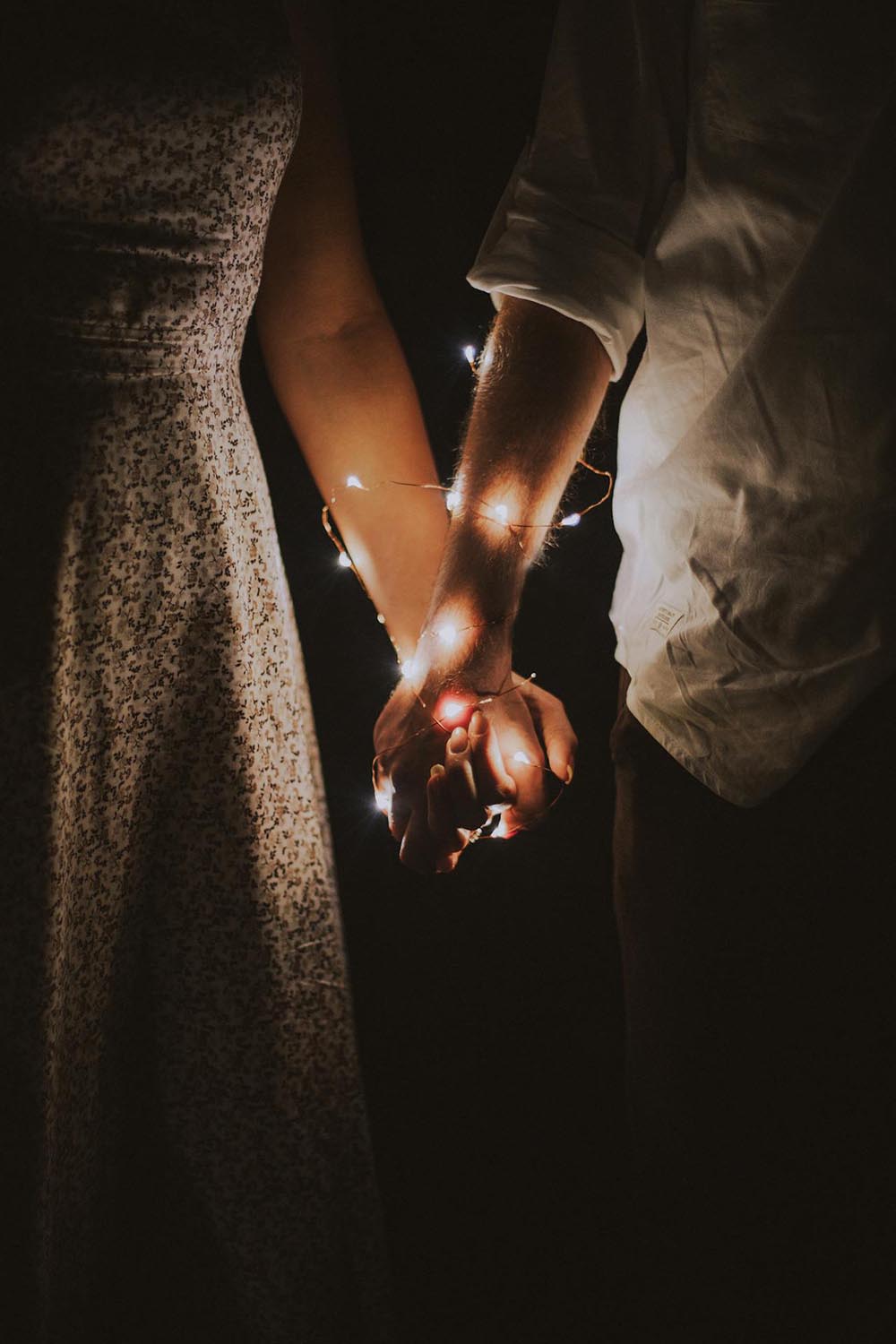
If you’ve ever come across a couple dressed in complementary colors, you probably couldn’t help but notice how visually appealing it looks, right? It’s almost as if they’ve added an extra layer of harmony and unity–as well as togetherness to their relationship with their outfit choices alone! Dressing in matching or complementary colors can project an image of coherence and consent–it displays a memorable batting partnership where both players strengthen and enhance each other’s game. It’s a subtle–yet impactful–way to show the world that you’re not just two individuals–but a unified duo. A team. It’s like saying, “Look, we even got our wardrobe in sync!” Plus, let’s be honest, it also makes for some really adorable couple photos!
When couples hit the town, matching in style is like a silent announcement of their bond. Think of a classic pair: black and red. This duo is the epitome of luxury, perfect for painting the town on a chic evening out. The reason this combo rocks for night events is its power to command attention; red pops against black, making a couple stand out in the most sophisticated way. It’s like they’re wearing their own VIP pass.
For those chill days, beige and powder blue are the go-to. Imagine strolling through the park or heading to a laid-back cafe, these colors suggest comfort without sacrificing style. They’re the equivalent of a relaxed weekend playlist – just right for unwinding. This pairing is key for daytime dates because it communicates a cool, easy-going vibe while keeping the fashion factor dialed up.
And hey, who says workout wear can’t be stylish? Couples can sync up their gym look with matching hoodies for couples in these same soothing shades. It turns a jog in the park into a coordinated effort, both in the workout and the style department. It’s important because it adds an element of fun to staying fit, and let’s be honest, a little couple’s charisma might just add some extra motivation for those extra miles.
Then there’s the office or those formal gigs where you need to look sharp. Rusty pine green paired with burnt umber is an intriguing mix, ideal for those events where you need to dress to impress. This combination says, “We mean business,” but in the most fashion-forward way. It’s a nod to individuality while still keeping things professional, showing that a couple can be serious without being dull.
So, whether it’s a night out or a day in the park, picking out complementary colors is about making a statement together. It’s a visual connection that says, “We’re on the same wavelength.” It’s not just about looking good; it’s about feeling in sync. And isn’t that what being a couple is all about? Matching styles can be a playful, stylish way to showcase your partnership to the world – or just to each other.
##